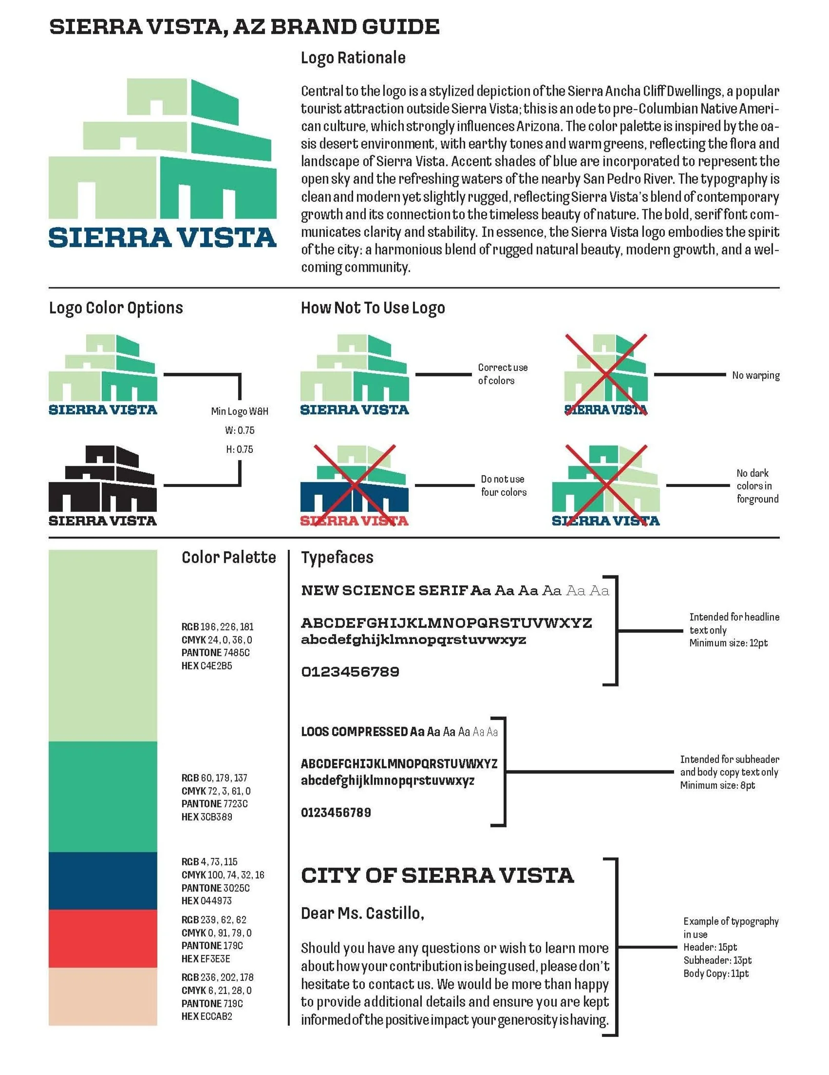
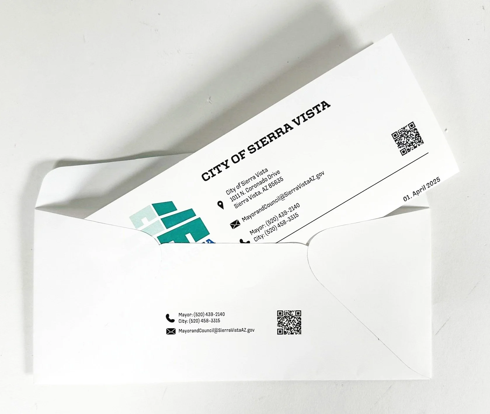
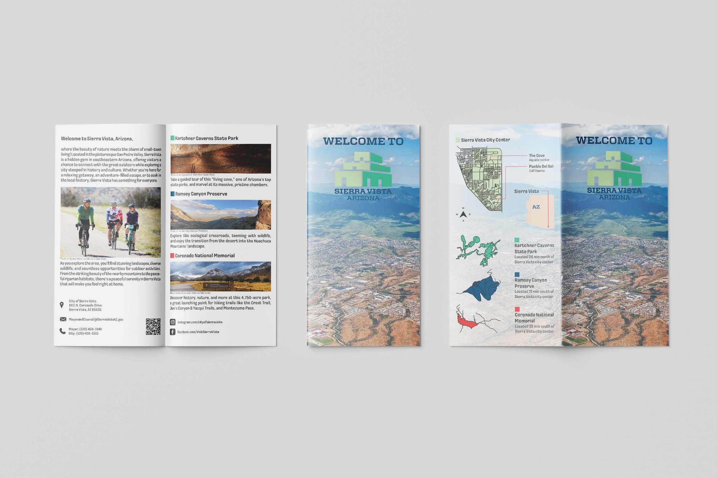
US City Branding
I established a theme by creating mood boards that helped guide the creation of the logo, stationary package, rack brochure, and brand standard sheet. The theme throughout my branding for the city of Sierra Vista, Arizona, was a warm, inviting community of a Deseret oasis town dedicated to the colors green, blue, red, and tan. These colors represent the desert floor, the mountains, and the sky. When designing the stationery package, I used a stark white background to accentuate the logo colors that represent the flow of the San Pedro River to the green Huachuca mountains that look over the city. The hierarchy used throughout the project is consistent with slight variations in point size with smaller items like the business card and envelope. The rack brochure is a playful and inviting object that tourists can view with a welcoming aerial photo of Sierra Vista and a custom city map with must-see locations inside.

Process Sketches
Exploring combination logo and monogram logo designs


B&W and Color Logo
The colors in the logo represent the green mountains and blue sky of Sierra Vista, Arizona


Brand Guideline Sheet
The colors used represent the desert floor, the mountains, and the sky