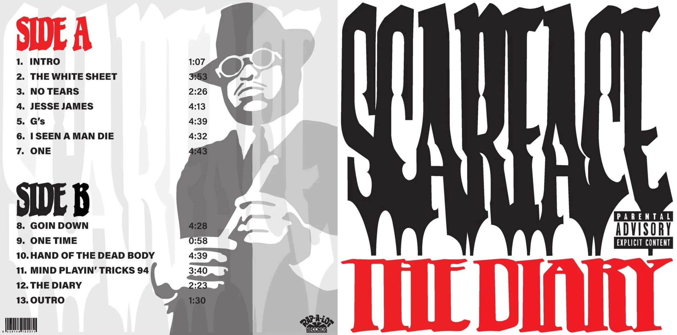
Album Cover
I picked type manipulation as my primary technique in this project. On the front of my album design, the word “Scarface” is jagged and almost haunting, representing evil. The text in “The Diary” is stretched with slightly rounded corners, representing a soft, good side of the rapper. The figure of Scarface is cut in half by a darker and lighter side, representing good and evil. “The Diary” text is a continuation of the front design, creating a relationship between the two sides. Side A represents the good side of Scarface with light red and white text, whereas Side B represents Scarface’s evil side with dark black and white text. The relationship between good and evil, which is a primary theme in his music, is portrayed in color, and manipulated text is used throughout the design to connect the visual elements as a whole.

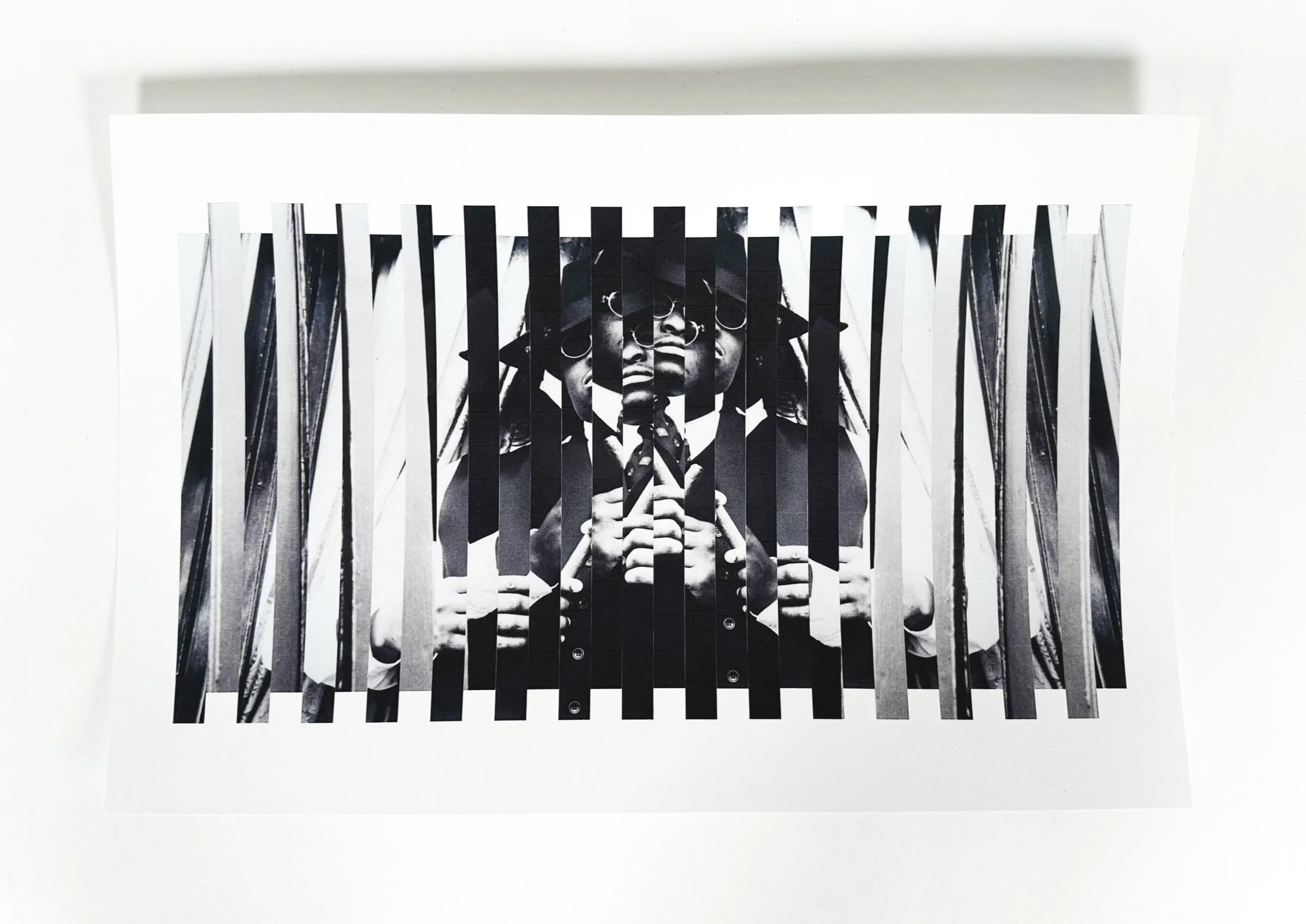
Process Sketches
Exploring the making processes used in the final album cover design: type manipulation, photo manipulation, and transparency layering


Final Album Cover
Use of type manipulation by dragging text on the scanner bed and transparency layering
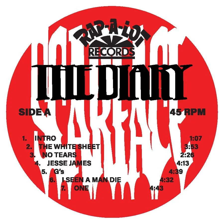
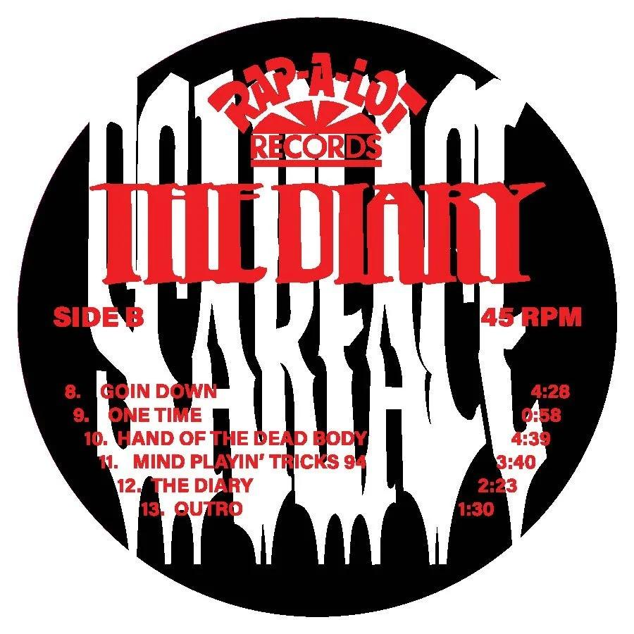
Side A & Side B
Use of type manipulation by dragging text on the scanner bed and then vectorized
Phone Mockups
Examples of album design in Spotify

