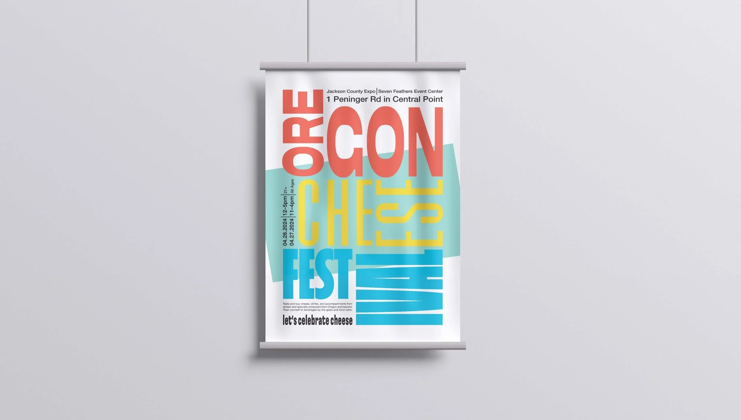
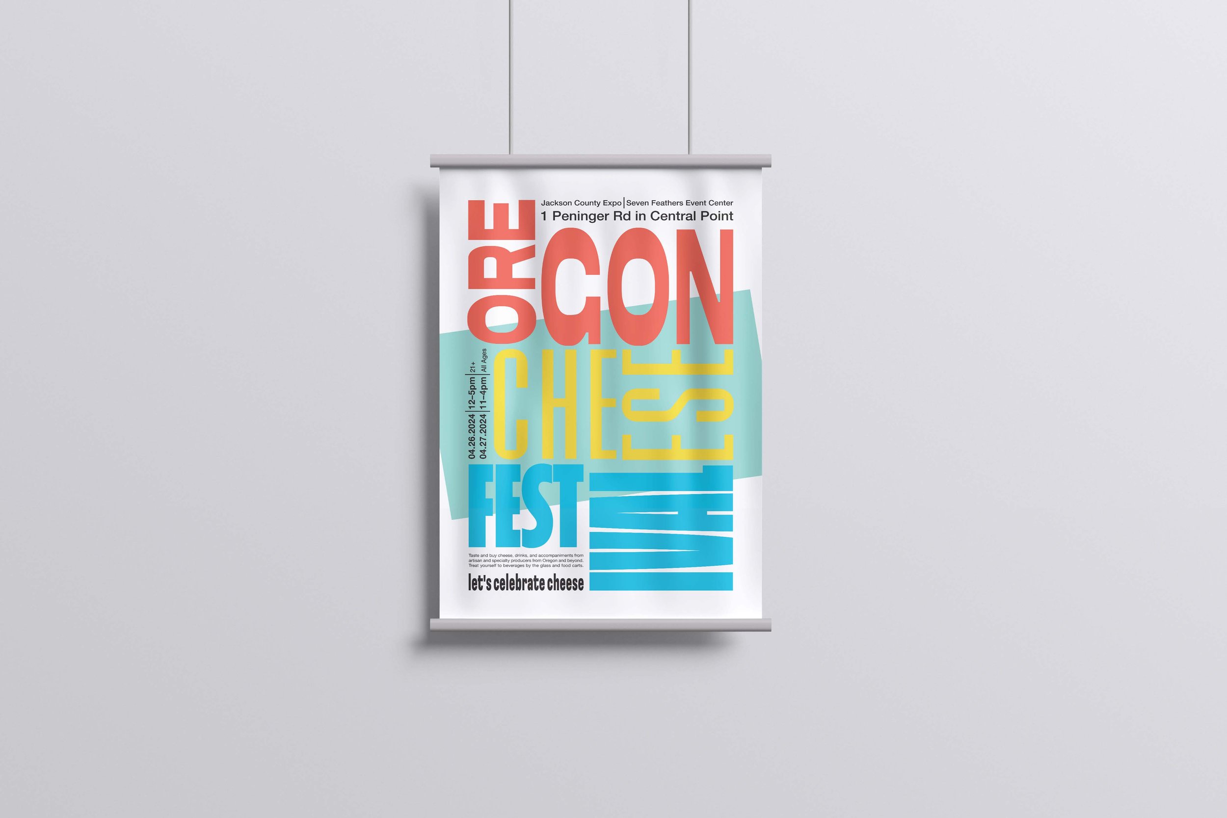
Typography Poster, Festival
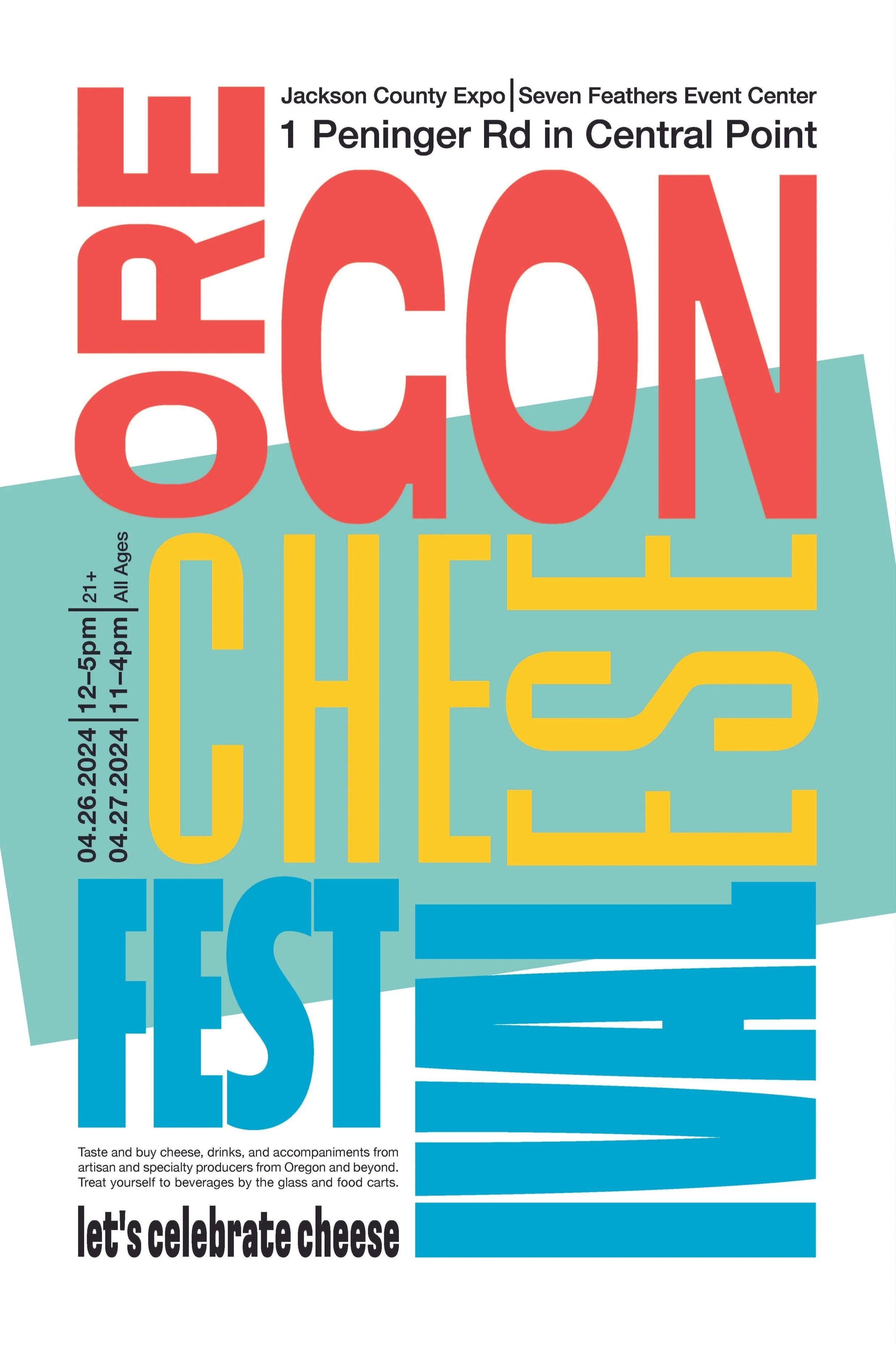
For the final design of my typography poster, I used a strong underlying grid to help spatially place content on the page correctly. All of my typefaces, ranging from tall and thin to squatted and bold, were carefully curated and placed with intention. The typeface's characteristics and anatomy were exaggerated by pulling and stretching the letters out, a straightforward but effective manipulation. The use of hierarchy is clear, as the festival’s name is big and colorful to draw the viewer’s eyes to the title first. From there, more information is hierarchically provided, such as the time and date and what the festival offers. When looking at this poster with just the typefaces, something needed to be in the background to give the poster depth and character. A colorful rectangle was placed behind the text to draw the viewer in but not detract from the primary information presented in text.
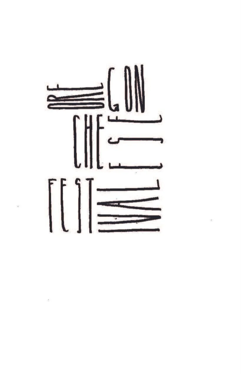
Process Sketches
Exploring the directionality of words and letters
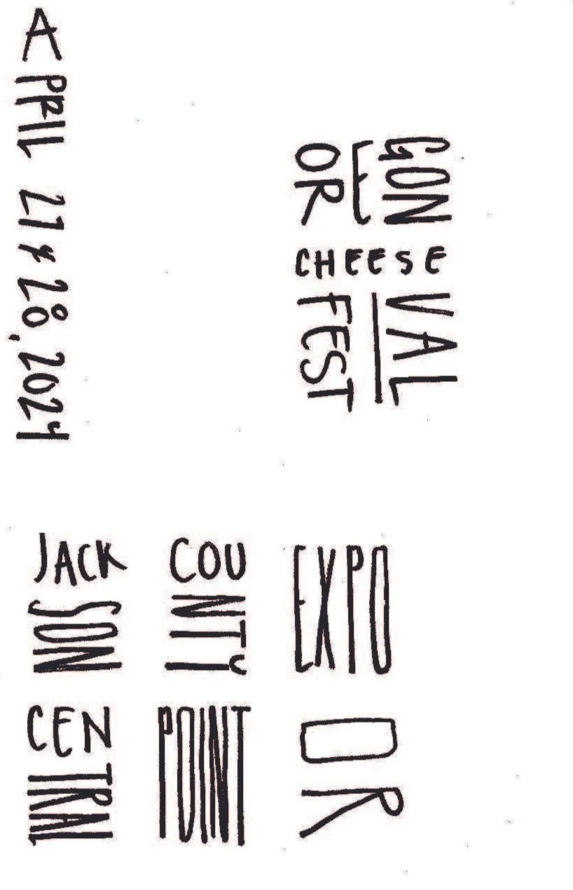

Before
Awkward dates, times, and location

After
Fixed dates, times, and location, as well as more vibrant colors
Final Design