Menu Design
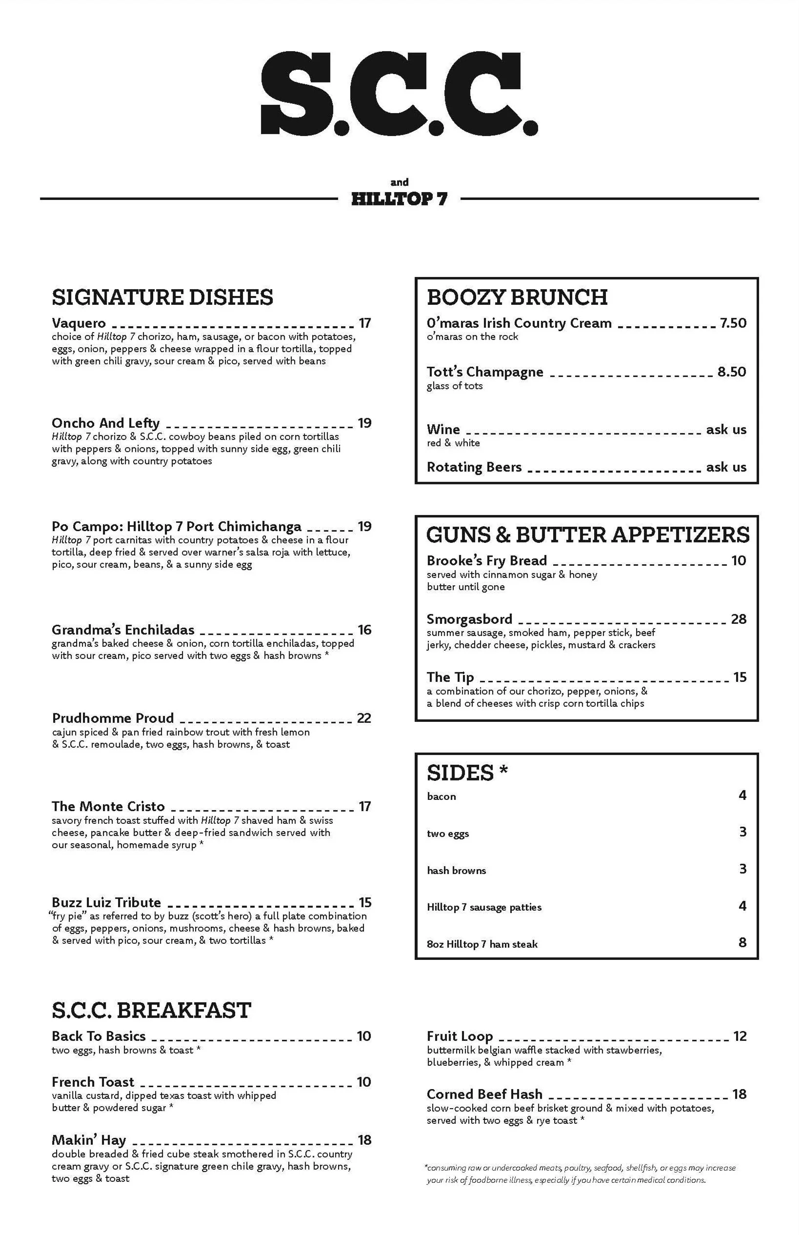
The important underlying theme throughout my design process in creating a new menu for Storm Castle Cafe was the significance of hierarchy. In examining the original Storm Castle Cafe menu, hierarchy was not taken into account. My first menu highlights the signature dishes by featuring them prominently, ultimately showcasing the most expensive items. Throughout my first menu, white text is accompanied by black boxes that emphasize the breakfast options. In my second menu, I chose to highlight the appetizers, drinks, and sides to draw attention to add-ons with the breakfast. The signature dishes section remains prominent, occupying the most space on the menu, right next to the emphasized drinks, appetizers, and sides.

Menu 1
Exploration of bold black headlines
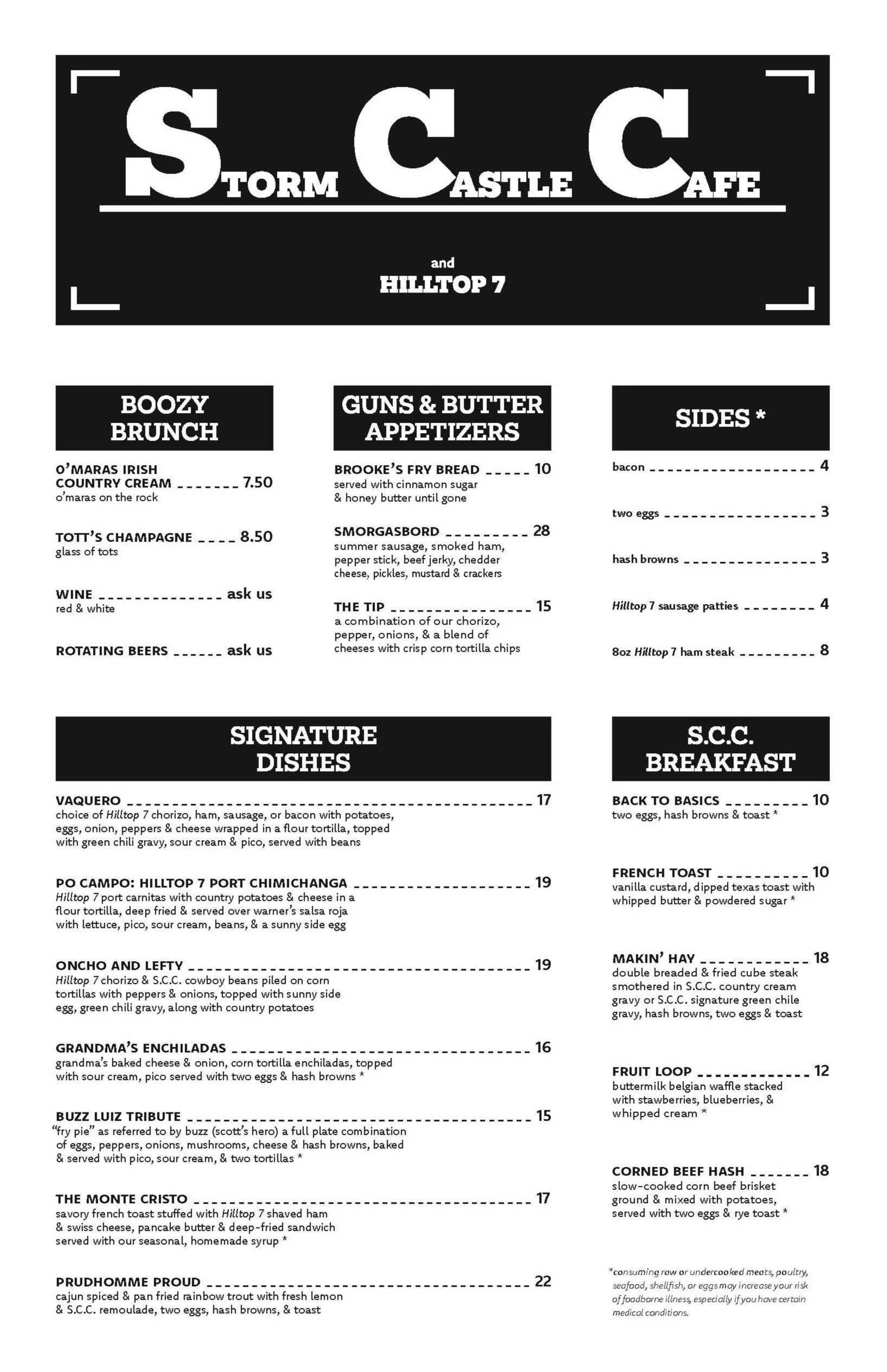
Menu 2
Exploration of white open layout