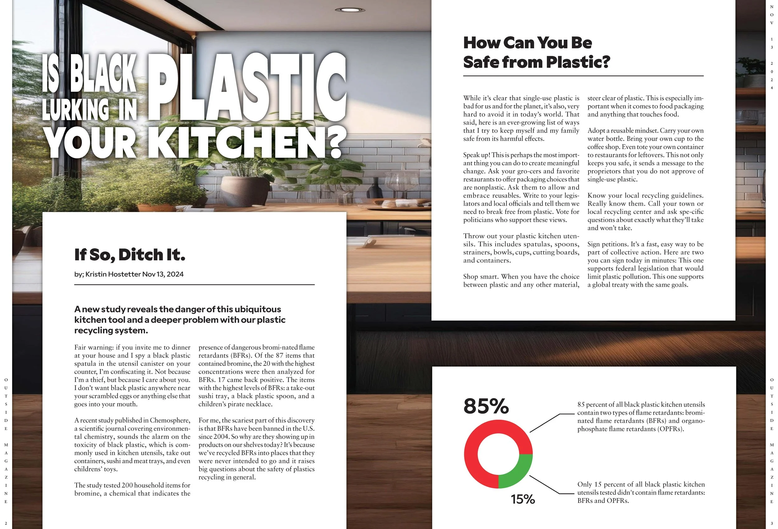
Magazine Spread Reboot
Different sketches were explored to determine my final design elements like hierarchy, type manipulation, and illustration. When creating the sketches, I considered making a cohesive two-page spread by incorporating body copy and image text boxes that spanned the middle of the two pages. Type manipulation was used to give hierarchy to separate words in the headline. I wanted to draw attention to the main subject of the article, black plastic. A light kitchen scene was spread across the two pages to give the already scary topic a more inviting and personal connection. As a complete spread, the imagery is comforting and familiar, inviting the reader, but the informative article warns about dangerous plastics in the kitchen.

Typeface Pairings
Bold san-serif header text paired with easy-to-read serif body copy

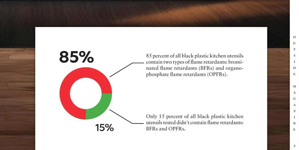
Zoom in of Statistics
Statistics of black plastic kitchen utensils that have harmful flame retardants
Final Design
Flat view of the final magazine spread reboot