Bitmap Monogram
Different sketches were explored to determine the final outcome of my design, such as bold letters, capital letters, lowercase letters, and thin letters. The two main sketches that influenced my design were bold lowercase and uppercase letters. Creating the bitmap monogram required an understanding of pixels, and I felt that bold lowercase letters fit the old-school vibe of early computer programming. When considering the design of the letter forms, establishing an x-height was crucial for it to be a typeface and to serve as a composition. Extending the ascenders and descenders was also important to distinguish the composition as a whole.


Process Sketches
Exploring bold, thin, and lowercase letter forms
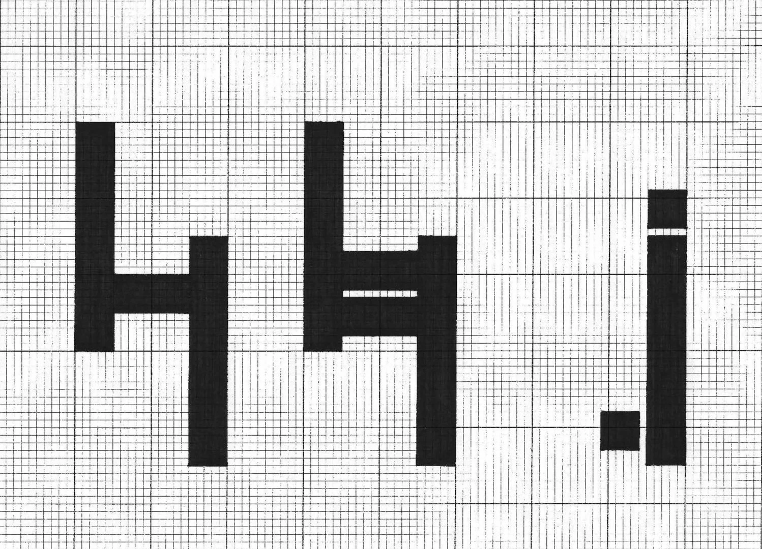
Before
No distinct x-height with short ascenders and descenders
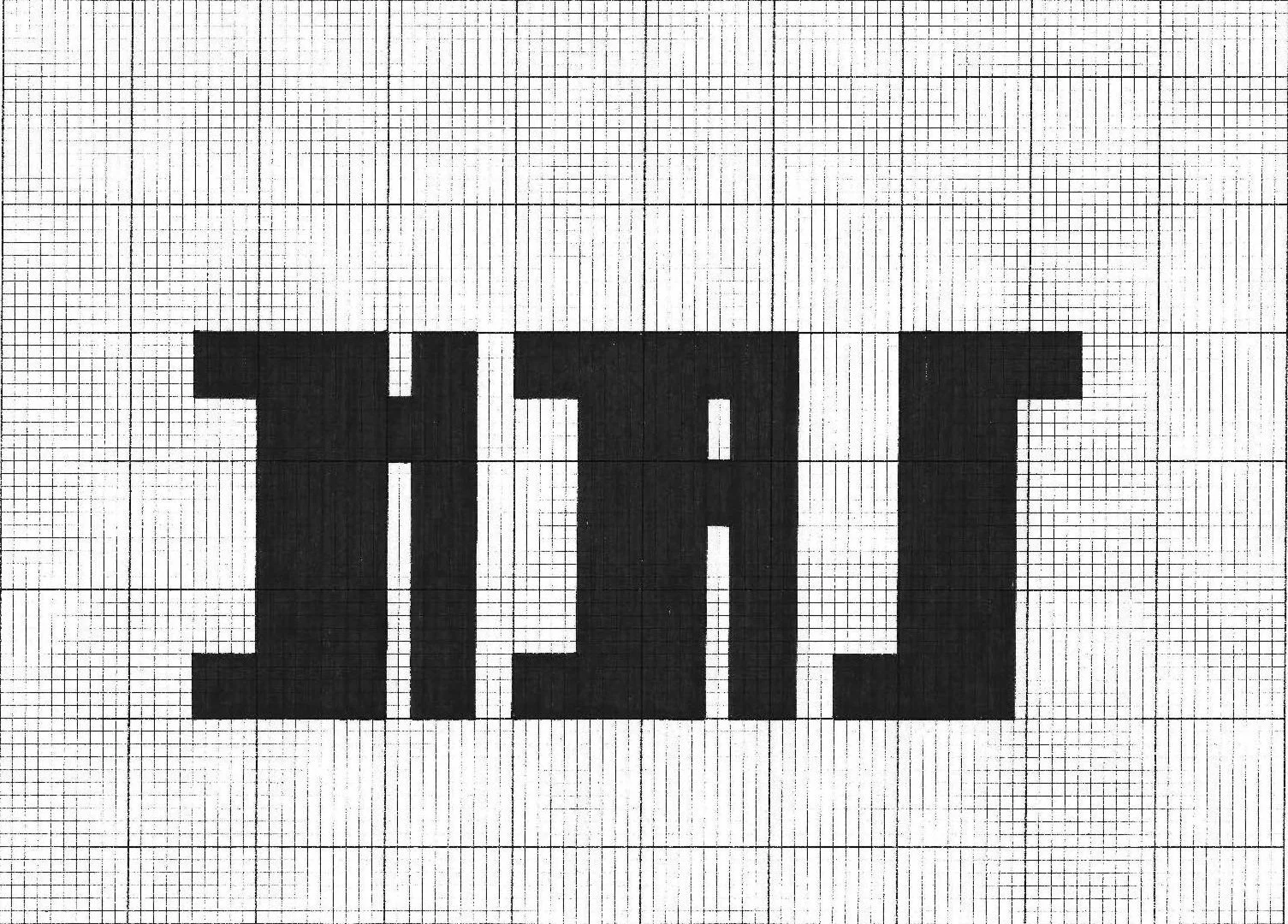
After
Distinct x-height with tall ascenders and long descenders
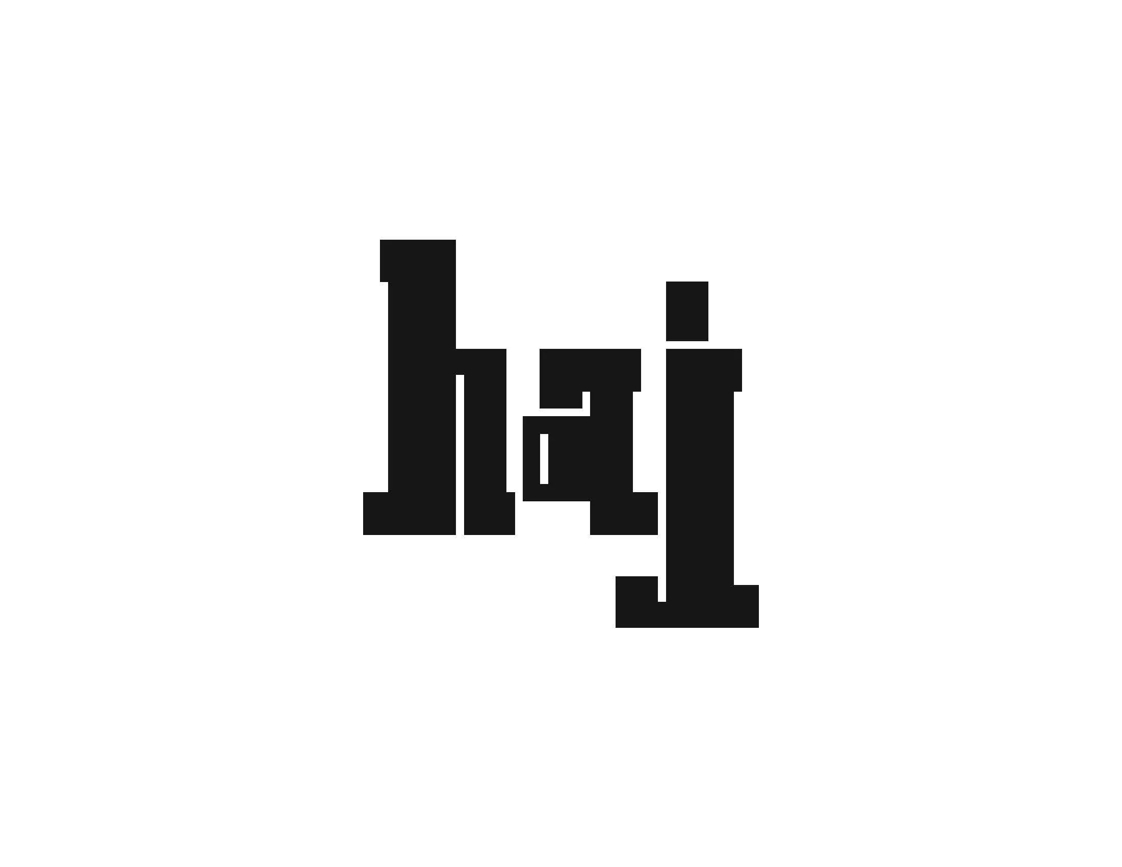
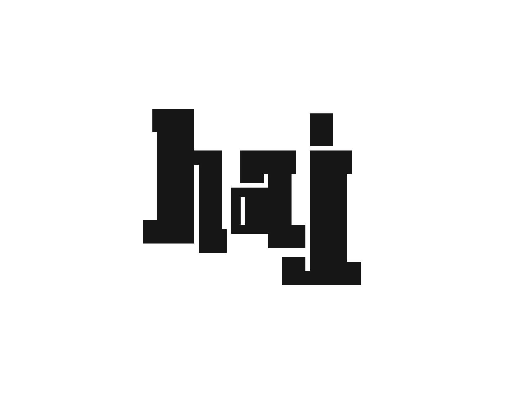
Final Design
